Project 2: SNAPSHOT
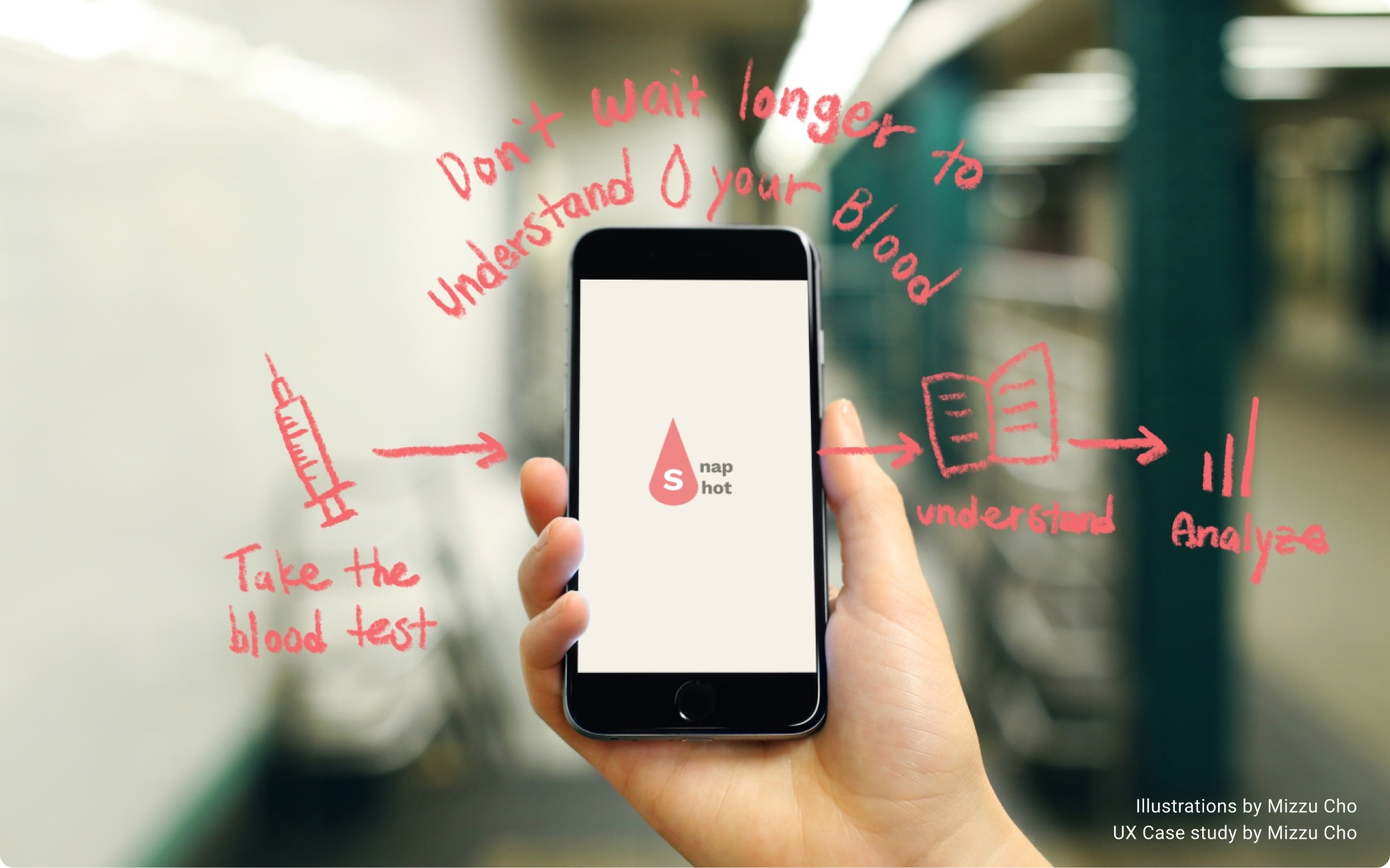
A mobile application to help users organize their blood results and analyze their health better.
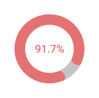
Don't remember where they placed their last test results
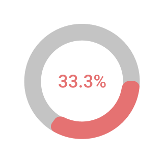
Don’t think taking blood tests regularly is eseential in order to stay healthy
Users need a way to organize their blood test results in one spot because people often don’t have a way to organize their entire blood results and a complex medical service system prevents people from easily accessing their own blood test results. These small frustrations discourage people from regularly taking blood tests.
We will know this to be true when the users could save time and frustration by storing their blood results in a secured storage application so they could get an instant explanation and instant access at any time, anywhere to keep track of their health.
Anyone with Snapshot could:
- Store all of their blood results in one place
- Get a brief explanation of the blood result instantly
- Visualize change in the result over time in a graph
- Look up medical terminology or health-related articles
- Remind your family member to get a blood test
- Share your blood result and date of your blood tests with your family members
- Look up nearby lab locations
Personal motivation:
- Work experience as a receptionist at a family medicine clinic
- Direct patient experience during the four out-of-country medical mission trips in the past
- My workaholic mom who doesn’t prioritize her health over her academics
Objective
Allow health-conscious individuals to log in to a responsive health and wellbeing portal to record their health and medical information as well as access general physical and mental wellbeing features.
My Role
UX UI Designer
Duration
10 months
Tools


(Google Form, Optimal Workshop, Figma, Usability Hub, Miro)
Design Process
1 Understand
Competitive Analysis
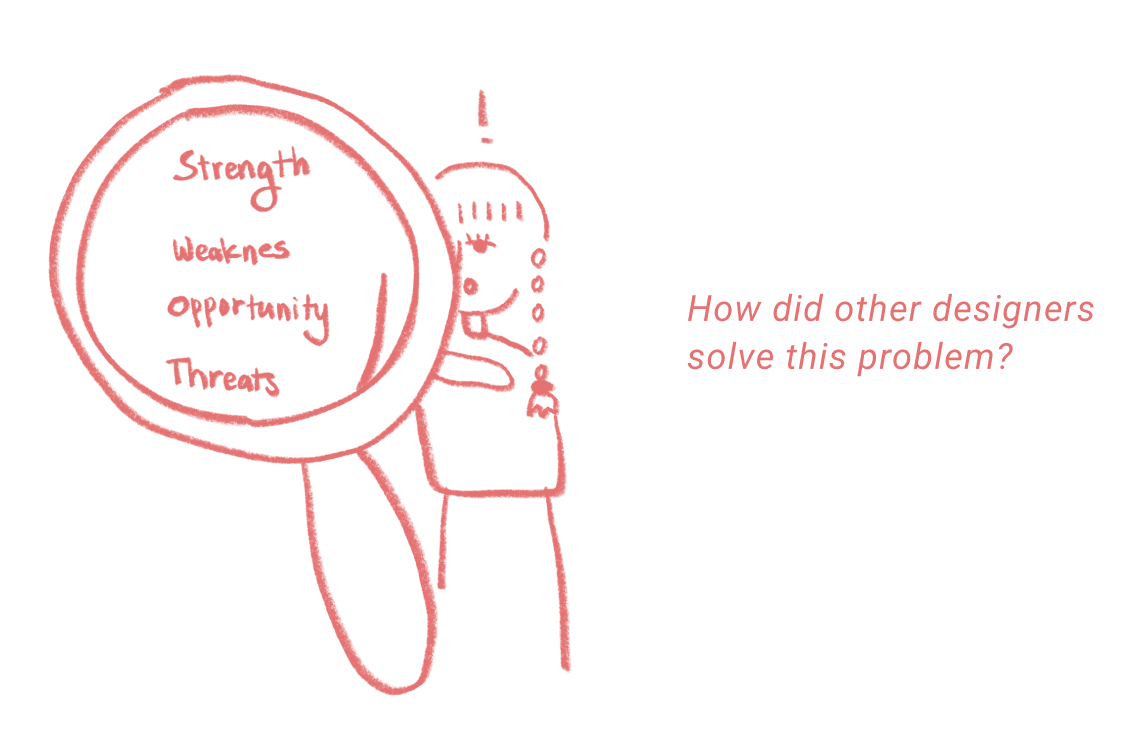
I conducted a S.W.O.T analysis on the health monitoring app Carrot Care and Sansara. It was important for me to investigate what existing applications are already offering to the audience. Both of the applications crucially lacked tutorials and guidance for the new users. This is critical because people who take the blood tests most often are the older adults who are not as comfortable with technology.
4 Interview & 12 Surveys
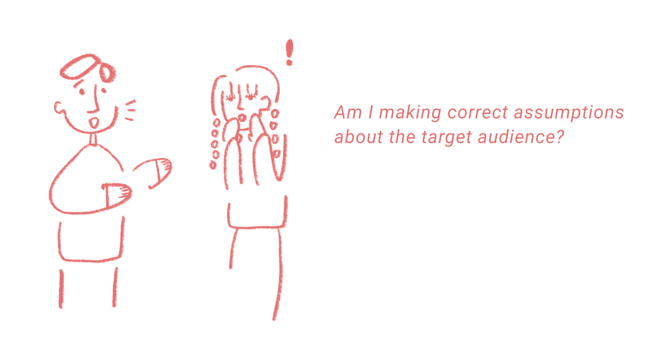
Interview: I learned that my initial target audience, people in their 50s, and 60s, are often intimidated by technology because they have lived in an era before the existence of technology. They would need strong motivation to learn how to use the application. I decided to make an accountability feature and shifted my target audience to the younger generation, the people in their 30s and 40s, for now in the hopes that they would motivate their older family members to stay healthy together.
Survey: I took surveys to study more about people’s perception of taking blood tests. The most interesting finding was that even though young people often don’t care about the blood tests, they are very interested in trying out a new health monitoring application. I also learned that people are more worried about registering credit card information than registering medical information.
2 Define
User Personas: Mind of the users
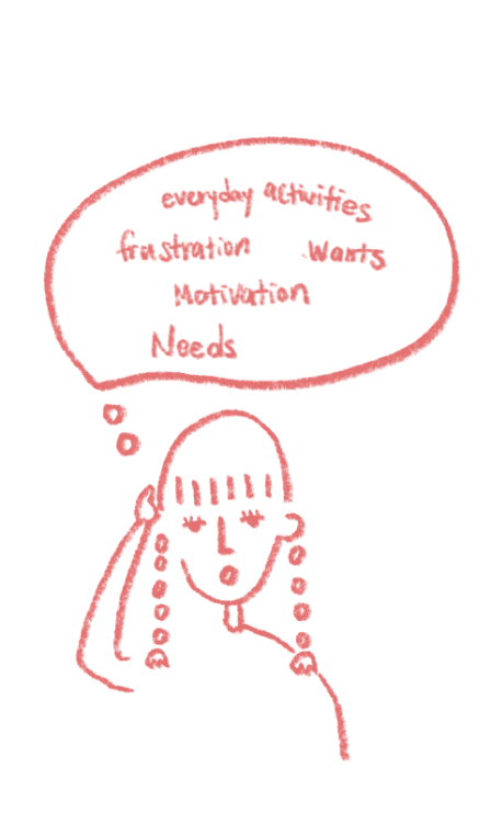
This was the most difficult and exciting part of the entire design process for me because I got to push my creative ability to visualize the life of the users that don’t exist in real life. Laying out several personas with different personalities and lifestyles helped me redefine the reasons why people would need to use Snapshot. This is crucial because it also redefined the reasons why people wouldn’t use Snapshot. The deeper empathy developed throughout this design process helped me imagine what kind of relationship I want users to have with Snapshot and visualize the lifestyle of the people using Snapshot in their daily life.
User Journey: Motivation behind the actions
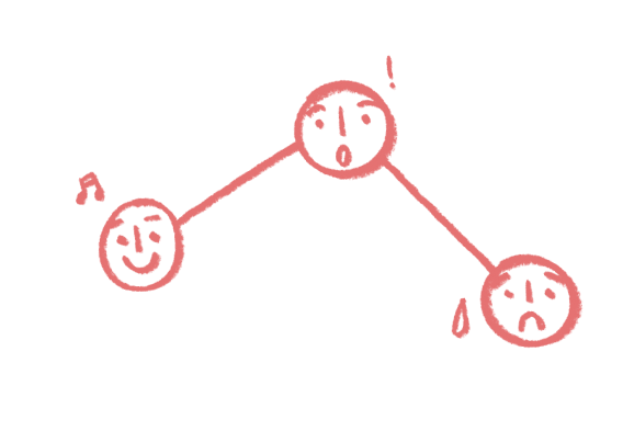
I really tried to get into the mind of the personas and understand their attitude and motivation behind every step they would take using Snapshot. The specific questions raised up during this process were: How should I approach the users when users experience problems with Snapshot? How can I make users feel comfortable enough to reach out to the team to solve the problem instead of exiting the application?
User Flow: Application to the design
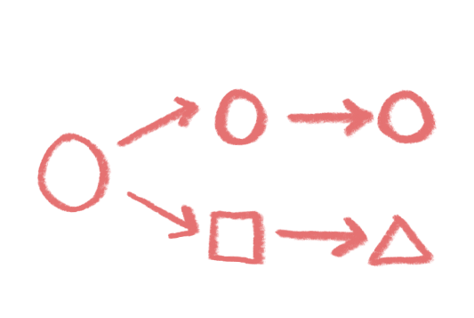
After analyzing what kind of actions would be triggered by different emotions, personality traits, and responsibilities of each persona, I mapped out all the possible paths users might take in order to accomplish a specifc task.
3 Ideate
Card Sorting
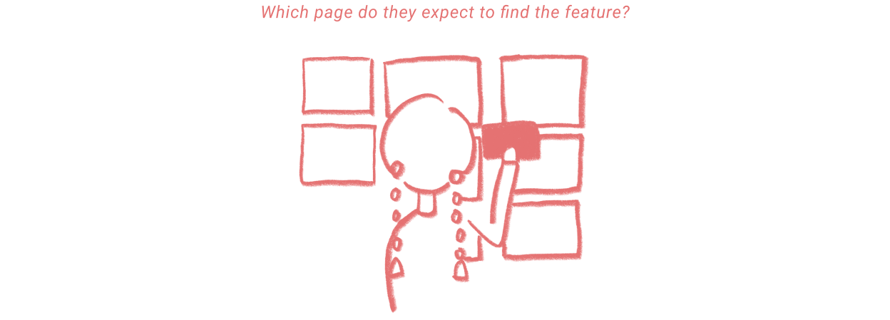
I used an online tool called Optimal Workshop to conduct card sorting tests with five participants. The red dots on the graphic down below is what I expected participants to choose, and the blue bots are what the participants actually chose. I realized that I might be still making a few wrong assumptions about the audience. For instance, participants expected to find the guidance and health advice on the search page, but I was not planning on including the guidance and health advice on the search page originally. This insinuates people might navigate to the search page for different resources, so I decided to create different categories on the search page to guide users to the right resource.
User Journey: Motivation behind the actions
Before creating the meats of the design, I wanted to create firm bones that would serve as a good foundation for further design decisions. I made sure that the I.A. contained the solutions for the three villains I address above (difficult access, difficult terminology, and unorganized data). I created a library page for easy access, a search bar to look up medical terminology, and an analytics page that would organize the entire blood results in a graph.
Simultaneously, I was worried that different features of Snapshot (profile, setting, lab locator, and reminder) would just leave users confused and steal the attention away from the main features (library and analytic) so I wanted to focus on creating a healthy design hierarchy that would draw users’ attention to Library and Analytics pages before the other sub-feature pages.
4 Prototype
Low-fidelity Wireframes
Time to bring all the ideas to real life! Hand drawing all the wireframes on the paper was really helpful to me. Creating digital wireframes online is efficient and time-saving. However, users interact with the mobile application on their own device physically. Thus, physically drawing out the wireframes helped me visualize how people would be interacting with each design component more realistically. Personally, traditional hand drawing practice helps me stay creative and dump out all my ideas straight from my head. However, hand-drawing prevents from making design iteration because it takes a long time. I would only be focusing on how I want to layout each design component for each page. I had to constantly tell myself not to spend too much time on the interface details.
High-fidelity Wireframes
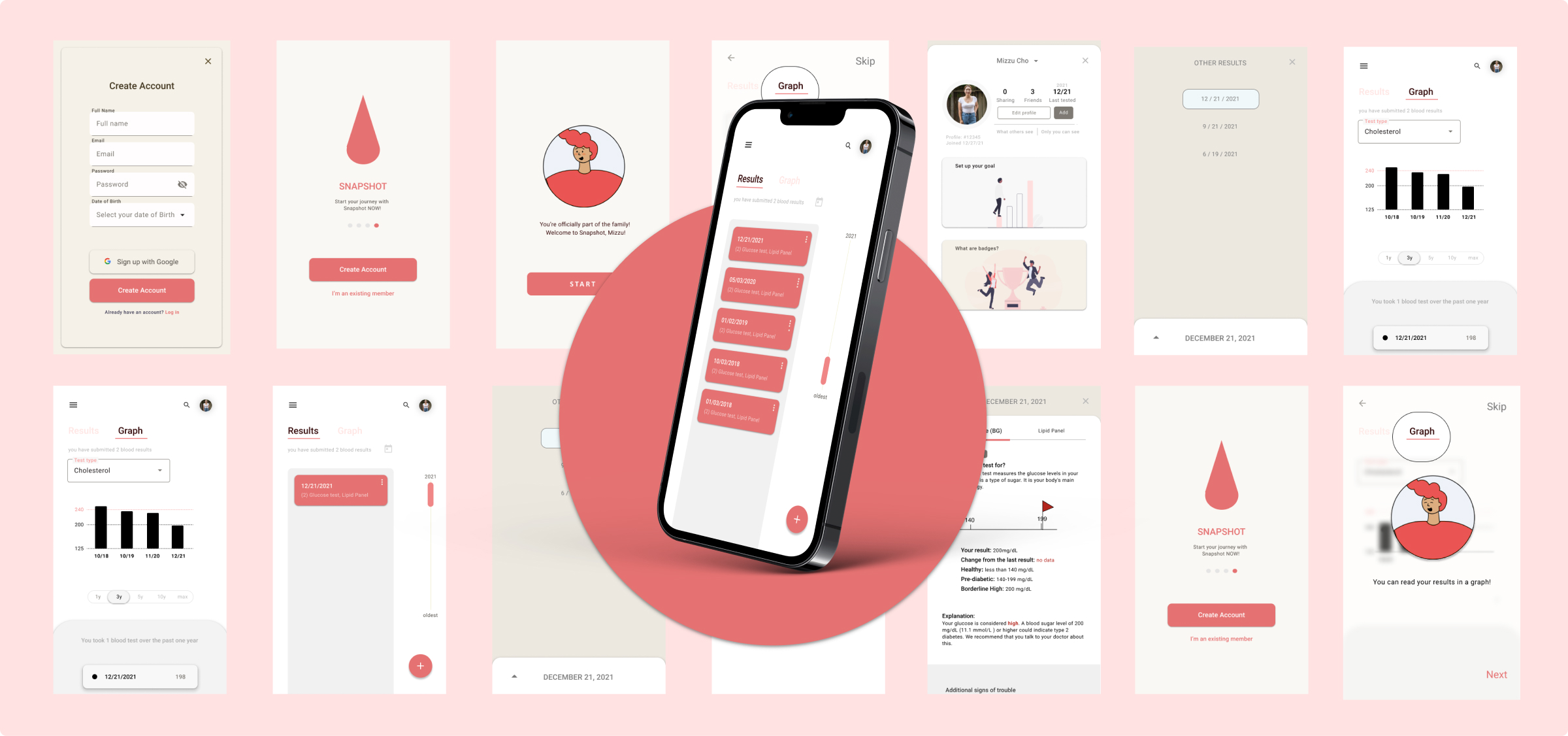
Time to add some meats to the bones. Using an online prototyping tool, Figma, I digitally transferred my low fidelity wireframes to the computer where I added colors and appropriate design components that would display a healthy design hierarchy. Throughout the entire process of creating high-fidelity wireframes, I engraved in my head to always question myself- am I creating a good memorability? good learnability? good accessibility? easy navigation? good color contrast? Easy navigation was the most difficult to evaluate because I’m biased towards my own design. Observing different case studies done by other designers and studying how other created minds connected different frames were the most helpful practice in jumping over this hurdle as a designer who’s learning how to prototype for the first time. You can view the polished UI at the bottom of this portfolio.
5 Usability Testing
( 6 Participants )
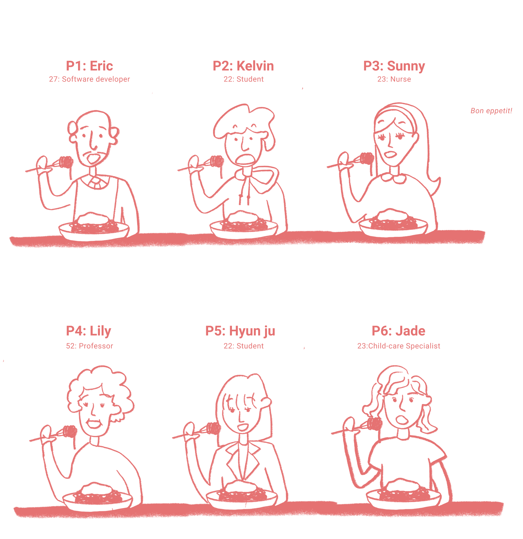
Key takeaways from the observations:
- Inconsistent word choices of “blood test result” and “blood readings” were confusing the participants
- Unrelated content on the result page confused the participants.
- The length of the onboarding was too long, and some of the survey questions felt irrelevant to the users.
- Participants wanted to see more guidance and tutorials.
- The majority of the participants thought the application was cool but too complicated for older adults to learn.
- Participants suggested adding more colors.
A/B Preference Test
One of the issues identified from the usability tests was the dull color system of the wireframes. I initially wanted to adapt a black-and-white color system to make the application look organized and formal. However, I personally agreed with the participants at the same time. I conducted an A/B preference test and found out that the majority preferred the colorful signup page, so I decided to adapt a more colorful color system across my design.
6 Refine and Iterate
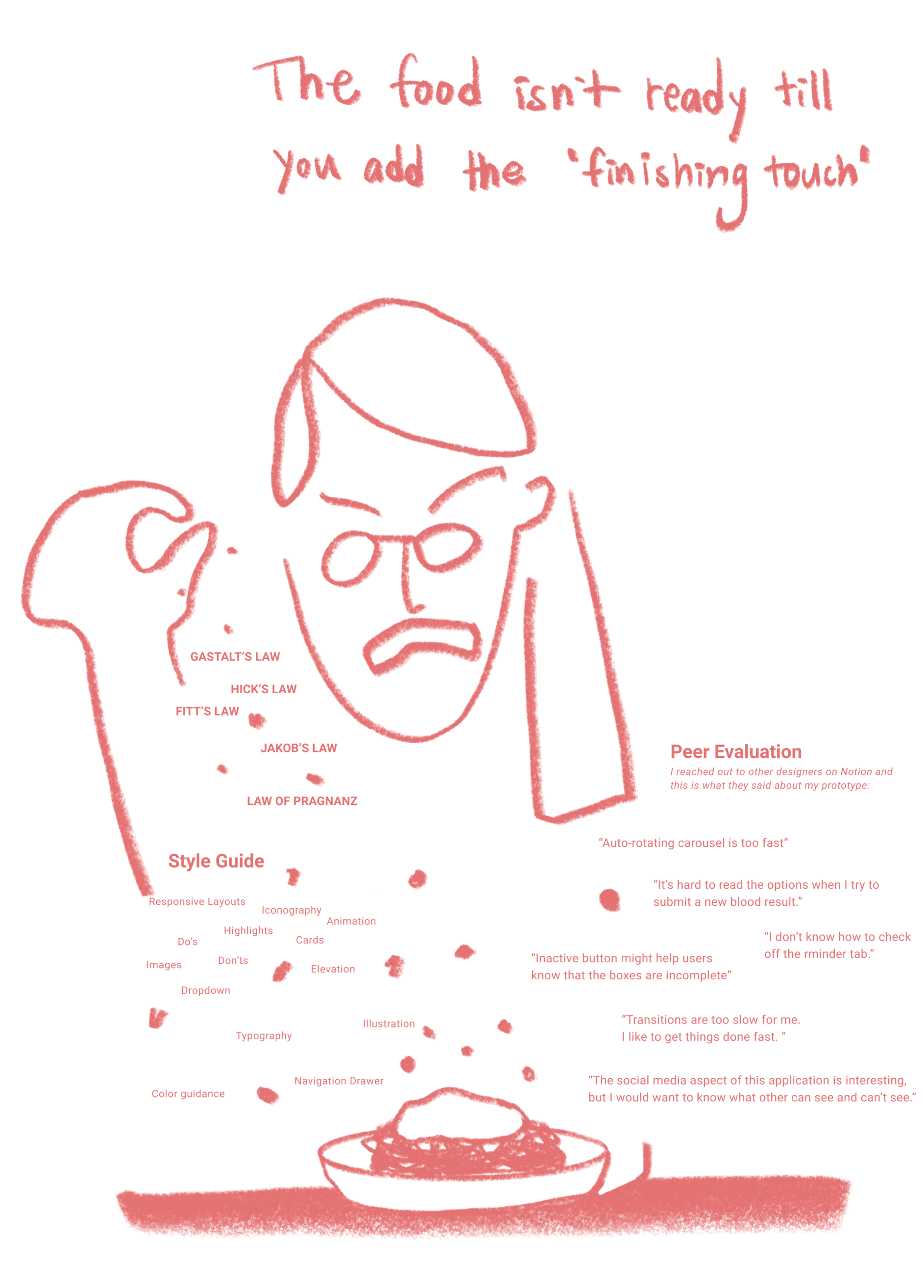
Polished Wireframes

Challenges
Working Alone: There were many times I was stuck between more than two ideas. During those times I wished I had teammates to ask for the objective perspective on the situation so I could move on. I learned that I tend to spend a long time making design decisions because I’m biased towards my own design. When I think back, I would have appreciated working with other designers because it would have given me another level of motivation.
Too much Freedom: Because I got to spend as much as I want on my project, I wasted too much time chasing the idea of the “perfect solution”. Since this is the first UX project I’ve worked on, I tried to build a firm foundation one by one rather than trying to finish the project as fast as possible. However, after spending a long time on one project, I’ve learned that achieving small goals on a planned schedule is more important and efficient than making compromises to be perfect because there is no “perfect design”.
Learning
You have to be a good person to be a good UX designer: The reason why I wanted to continue to grow as a UX/UI designer is that my journey as a UX design not only taught me how to make eye-catching designs but also challenged me to become an empathetic person. It forced me to really put myself in other people's shoes to understand their real pain points. The rewarding satisfaction coming from solving a problem that a lot of people might be experiencing around the world hits different.
What's Next?
Communicating skills: I want to become a designer who not only designs well for the customers but also designs well with teammates. I think the strongest skill one designer could have is communicating skills with the teammate to bring the maximum potential to the team as a whole. Thus, my goal is to work with different individuals with different backgrounds who will challenge me to become better at understanding the customers with different backgrounds.
Technical skills: As of now, I will continue to learn to master the software skills (Figma, Aftereffect, 3d illustration-blender, etc) and, at the same time, I want to be involved in teams that would challenge and guide me so that I could build a firm foundation and grow mentally flexible and strong.
Big dream as a UX/UI designer: As a person who has work experience in healthcare and a deep interest in AR/VR, I’m deeply interested in healthcare UX/UI and AR/VR UX/UI. Hopefully, there will be a new field where healthcare and VR are integrated so that I could learn both.
